
senior designer
2019-present
2019-present
Overview
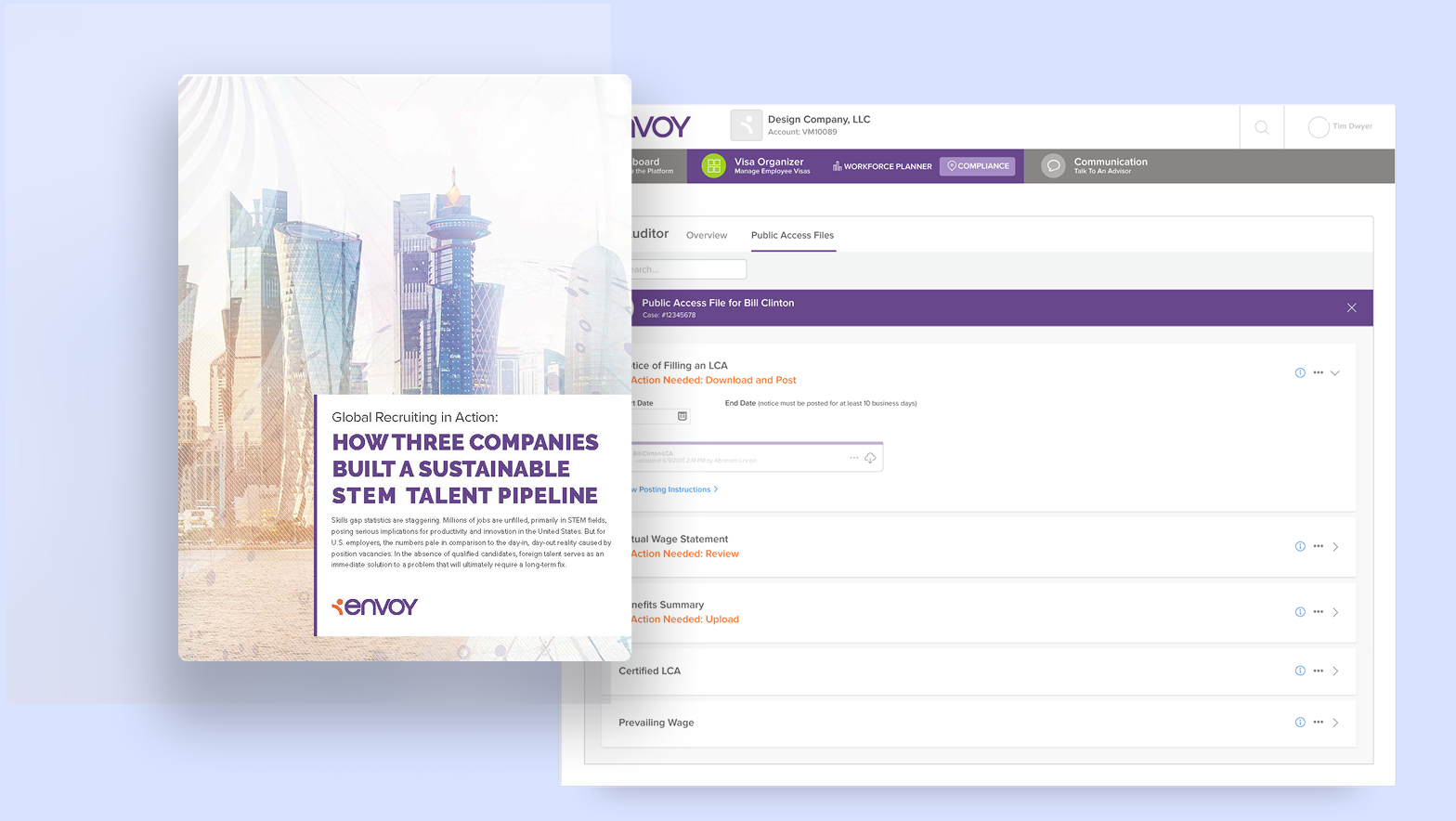
OptumRX and Optum Home Delivery Pharmacy is a member facing PBM, private-label product, and open market pharmacy, which helps up to 200 million users to manage their prescriptions.
Problem
OptumRX and Optum Home Delivery Pharmacy needs a flexible and scaleable design system that can adapt to wider and ever-evolving Optum Brand standards and individual client needs and themes. Users skew towards an older demographic and typically only need the product to complete a few very essential tasks a year needed to manage their health. Although typical user engagement is infrequent, the complex nature, sensitivity, and regulatory requirements of prescription benefits can make these simple tasks a complex web of terms and restrictions.
Solution
My team implemented a design system with clean, simple layouts and flexible structures, allowing the user to quickly identify medications that need their attention. Users engage with the product infrequently, but with a careful attention to detail and bring a mental model from a physical experience, where less technical understanding is required to complete their task.
Key considerations:
• Design a system that builds trust and familiarity with the user
• Create repeatable patterns for similar types of information, hierarchy, page types, tasks or flows
• Build components that allow for custom themes for different clients
• Design a system that builds trust and familiarity with the user
• Create repeatable patterns for similar types of information, hierarchy, page types, tasks or flows
• Build components that allow for custom themes for different clients
Results
Since we began implementing the new design system we have seen an increase in NPS by an average of 10 points and a 25% increase in task completion.
Since we began implementing the new design system we have seen an increase in NPS by an average of 10 points and a 25% increase in task completion.
The system has continued to evolve based on new product features and enhancements and further learnings from user feedback taken from a mixture user tests, data analytics, and live recorded sessions using Glassbox. The component structure has given us the flexibility we need to adjust based on these new findings, requirements, and brand updates, mitigating tech debt on the both design ad development.
My impact
As a senior and lead product designer, I have worked closely with a small group of front-end developers to ensure and inspect that the development tokens and components match our specs and maintain a working shared component library (SCL) in Storybook. We created over 20 different private-label client themes and scaled the system to 5 products (microproducts) across the Optum RX/Optum ecosystem. Additionally, as the lead designer on one of the core product capabilities I incorporated the design system and patterns into the existing legacy portal pages and flows, to give the user clear guidance on high priority tasks.
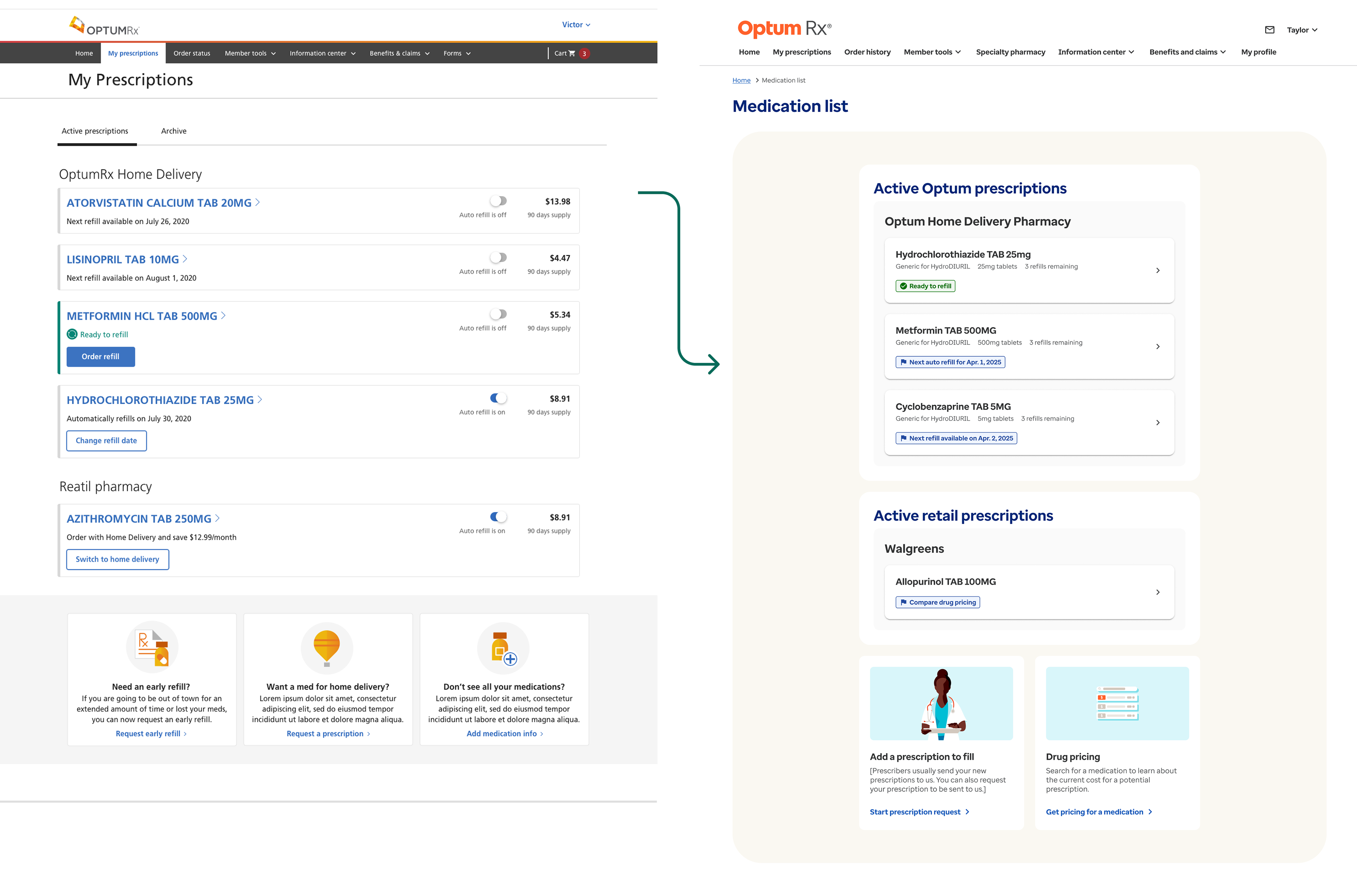
Comparison of the Medication list page before (left) and after (right) our new design system.
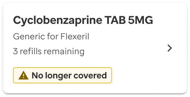

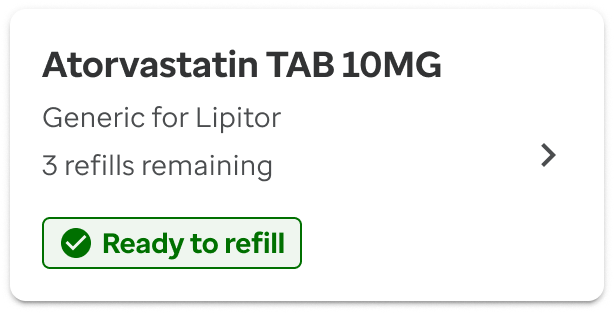

Example of content structure in clickable cards with added badge UI element to designate statues for different prescriptions

A similar content structure and set of rules are placed into larger parent containers to group related actions or content on a page. The basic card structure has a consistent use of padding levels, and border weight, color, and radius, depending on the use and hierarchy inside their parent containers. We worked closely with our A11Y engineers to ensure the hierarchy, code, and functionality of the cards exceeded WCAG standards.
Drawer actions
An early pattern we established was placing actions and additional copy inside drawers to allow the user to focus on one action or options to resolve an issue with their medication. Our goal was to reduce the cognitive load on the user by limiting the amount of information on the page and guiding them to the primary action.


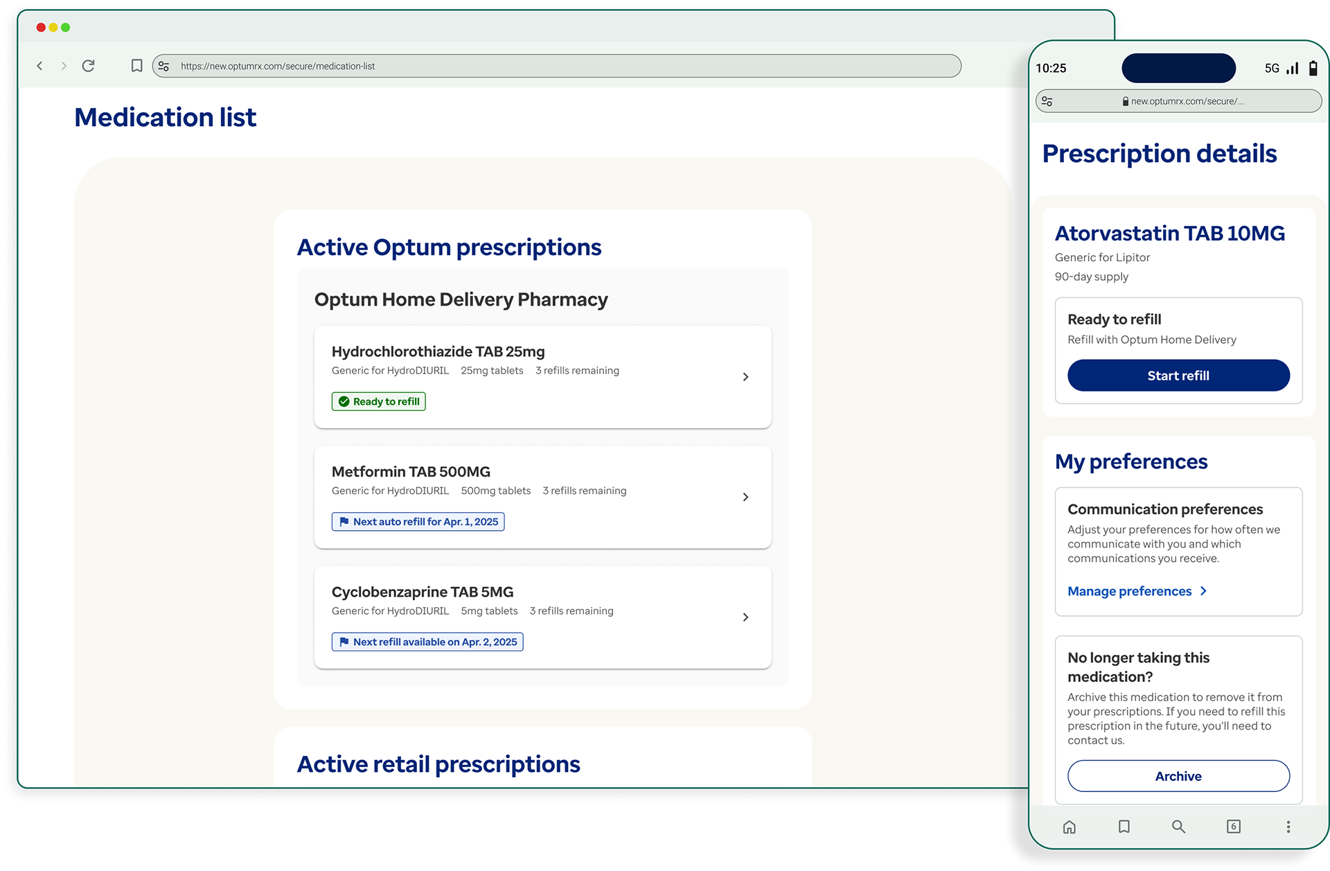
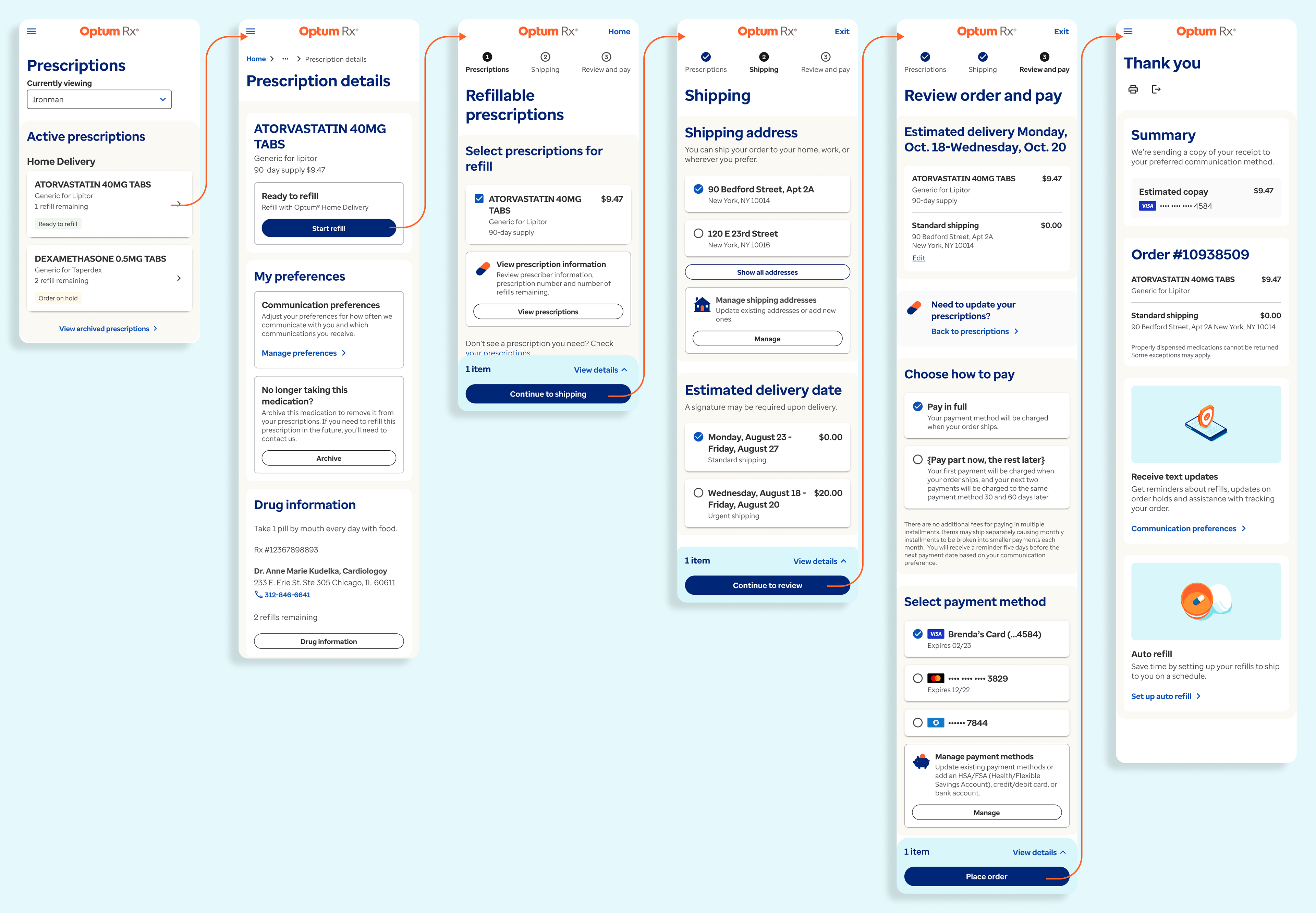
RX Management
The main capability we began the applying redesign to was RX Management. RX Management really only consists of two main pages, My prescriptions/Medication list and Prescription details. From the Medication list users can see the status of all their current active prescriptions and prescription details allows users to take action on any of their prescription statuses.

mWeb Prescription details pages showing various medication statuses needed for management
Renewal flow
We use consistent badge type and notification coloring and language through a flow. Additionally similar page layouts help the user move smoothly from page to page.

Refill flow
Summary
The initial changes made to the RX Management pages helped set the standard for our new design patterns and page templates that have now been incorporated into our SCL and larger design system. The next step is to begin integrating the findings and adjusting the look and feel to work with the border Optum product ecosystem, as well as a very mature and robust react native mobile app system.