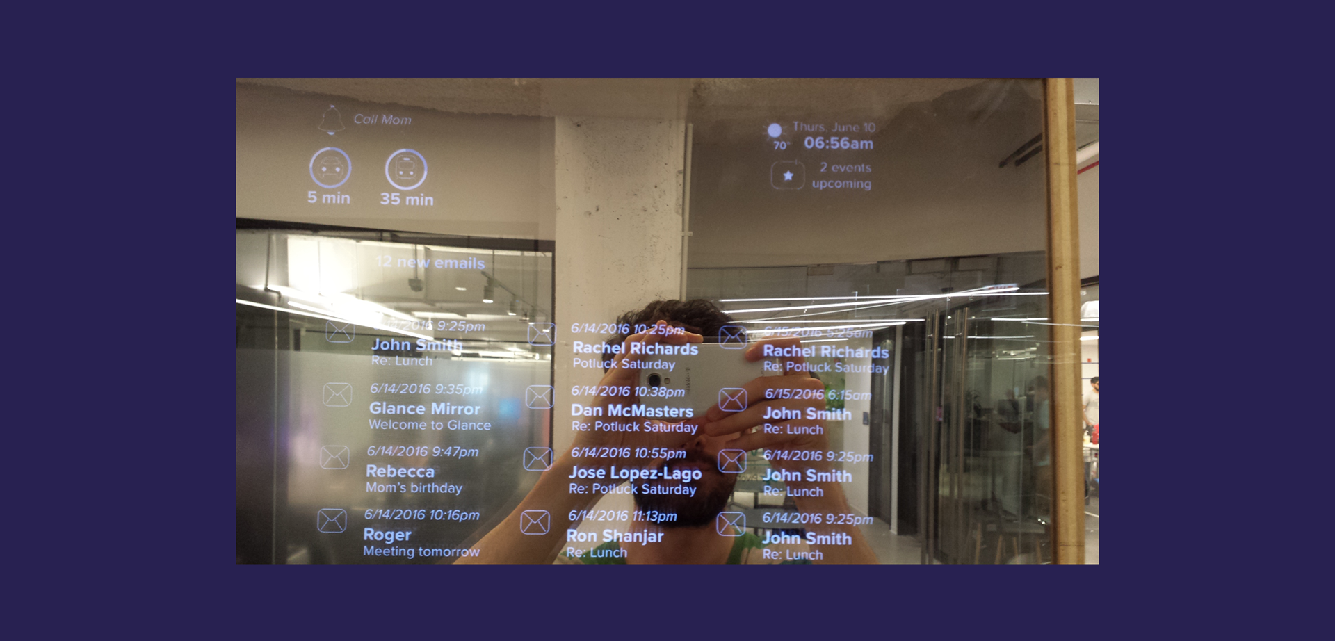
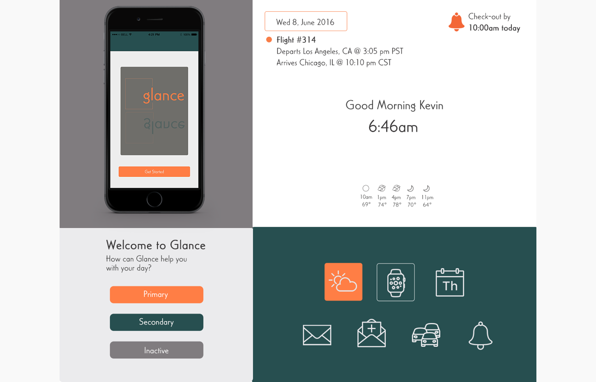
Developed by Windy City Labs, Glance is a consumer-oriented internet-connected smart mirror. Glance uses voice-recognition to provide users with contextual information about their day and upcoming events.
We collaborated with Windy City Labs' engineer, developer, and in-house designer to create individual stylings for the mobile companion app as well as the visual interfaces for the mirror in terms of layout, iconography, and type.
Key Opportunities and Considerations
Design a system to work on both the mirror and the companion app
Keep it minimal
Focus on text and icons
One or two colors works best
Style Explorations
Ambient style tile
Luxury style tile
Comfortable style tile
Design
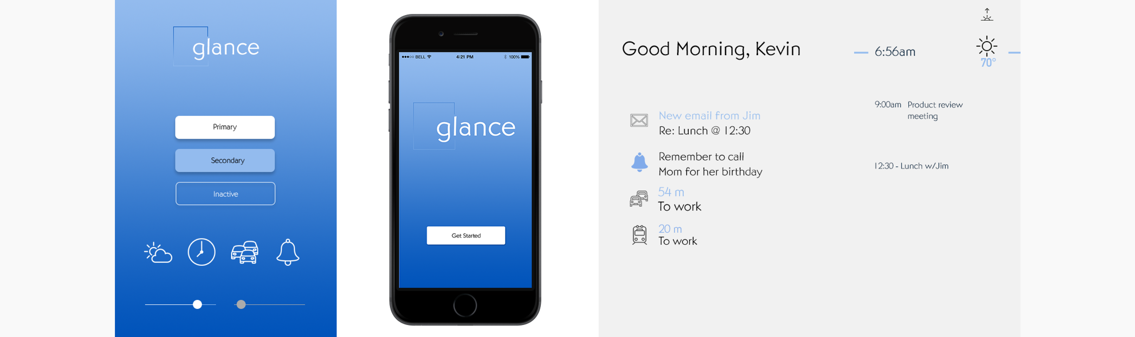
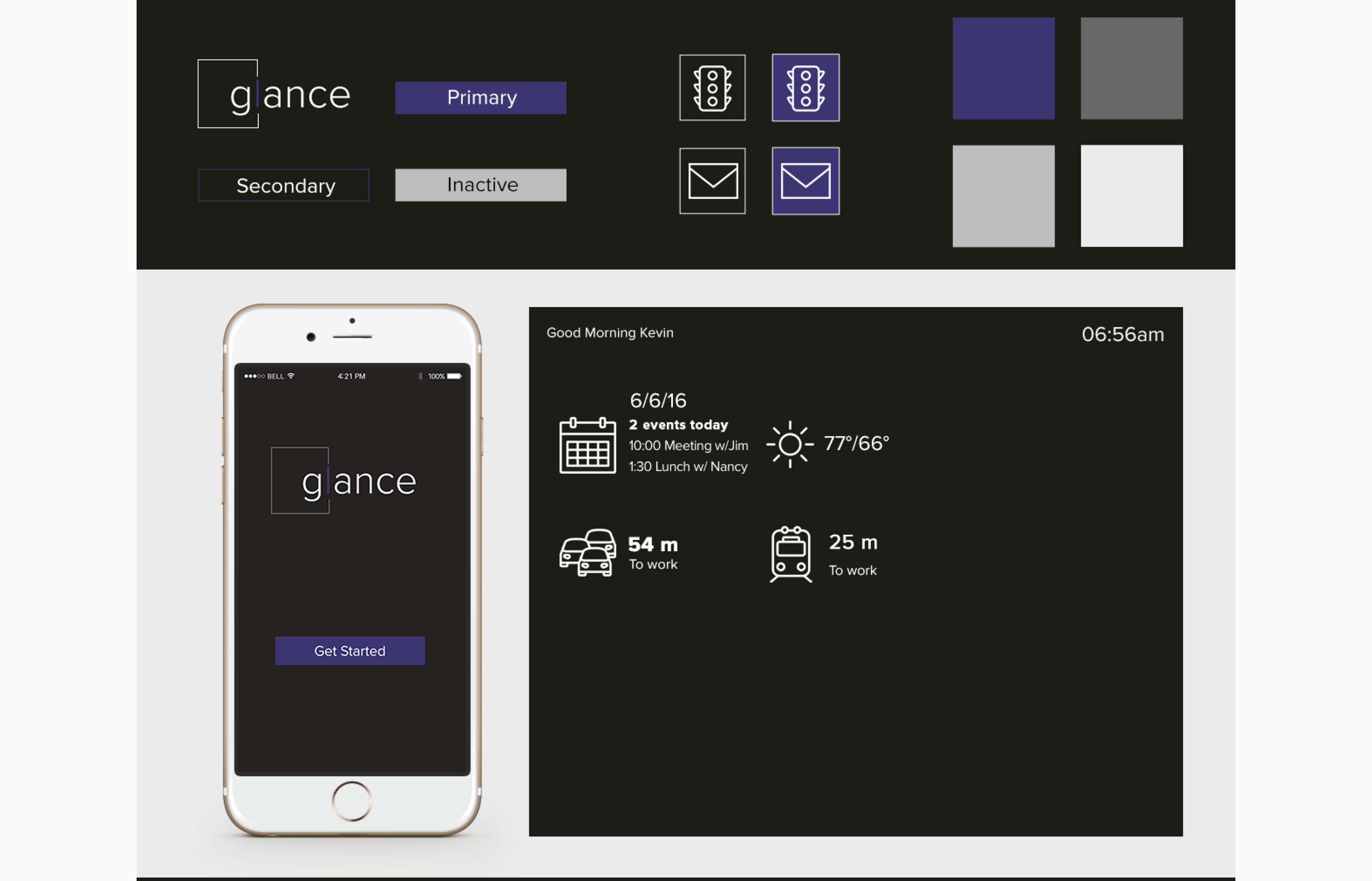
To overcome the challenge of designing a consistent brand for two different interfaces I created a design system that used the same styling for icons, font, and color.
Icons
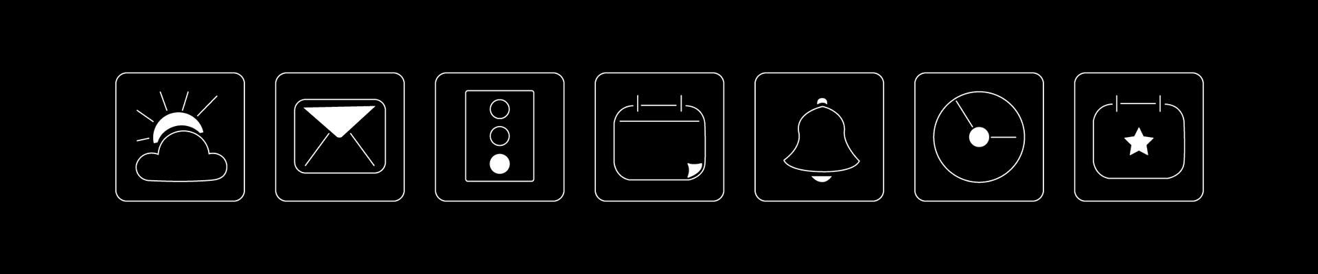
Icons for app
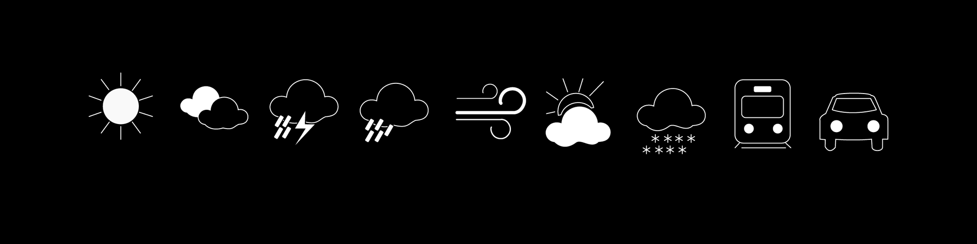
Expanded mirror icons
App Design
The companion mobile app for Glance allows users to customize their mirrors. The two user flows we focused on to design the UI were: Creating a New Mirror and Adding New Widgets.
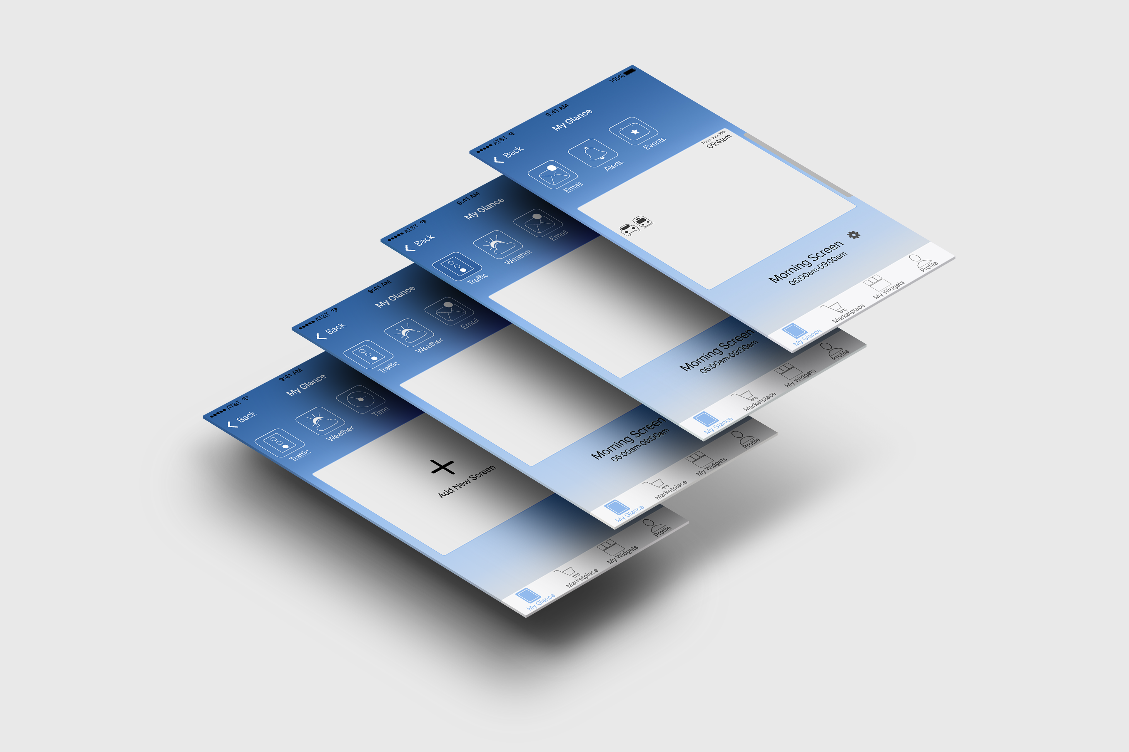
New mirror screens
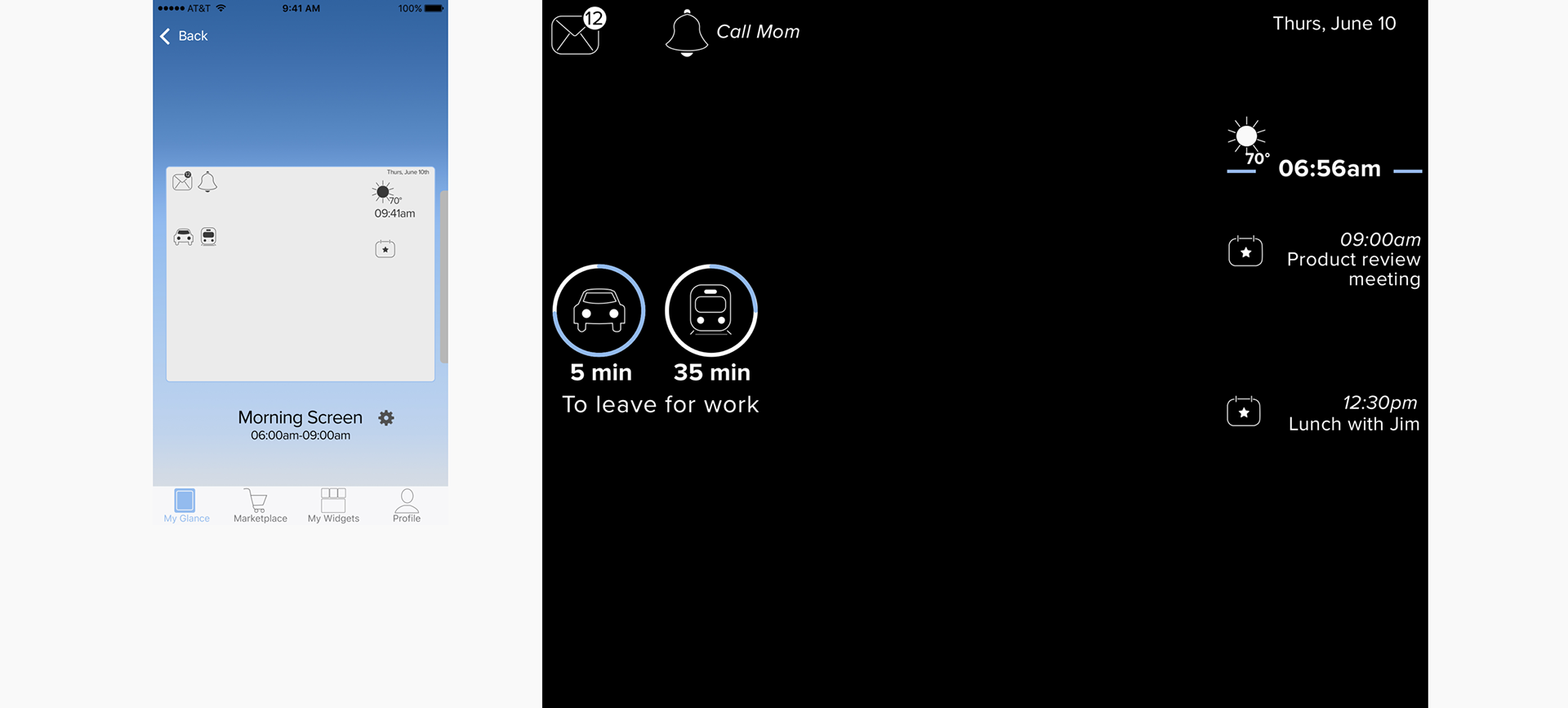
App mirror setup and actual mirror comparison
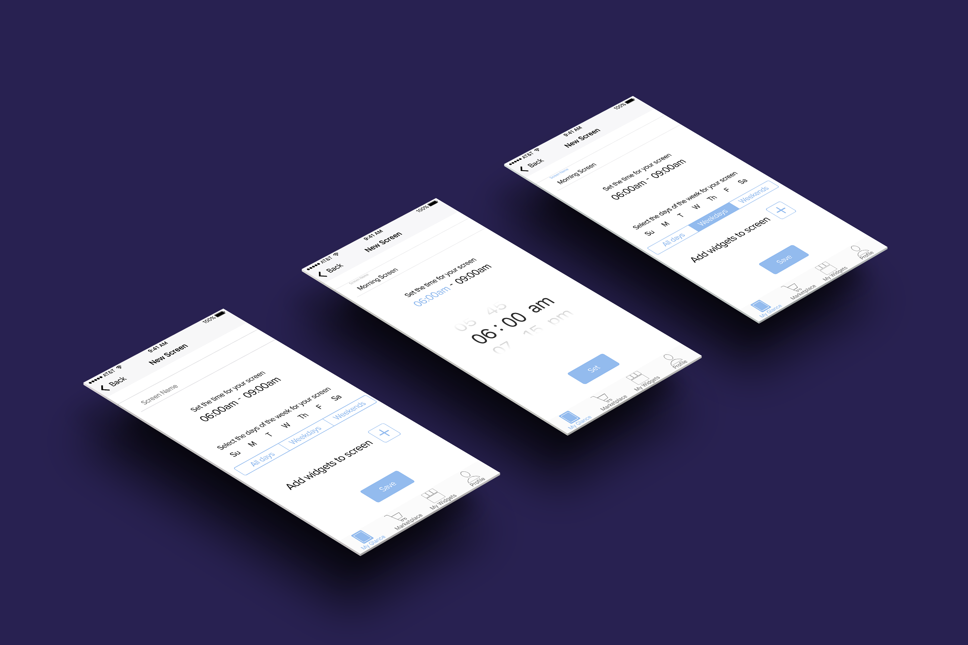
Screen setup form

Adding new widgets setup
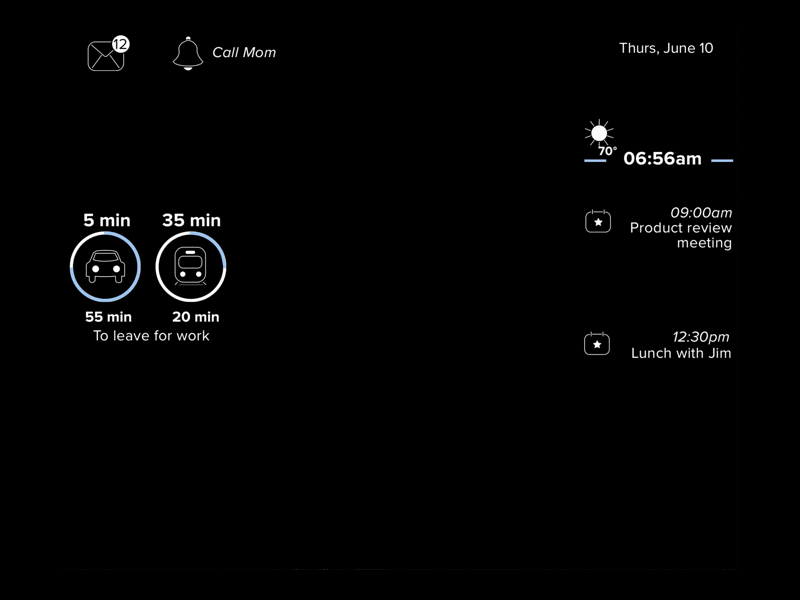
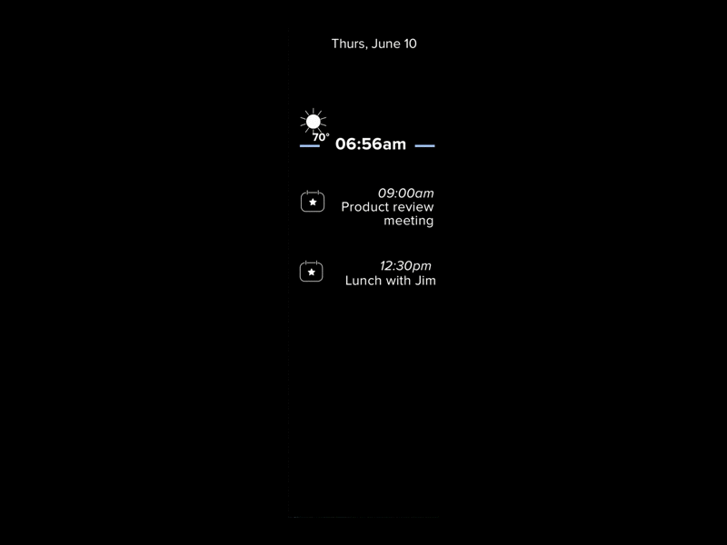
Mirror Design
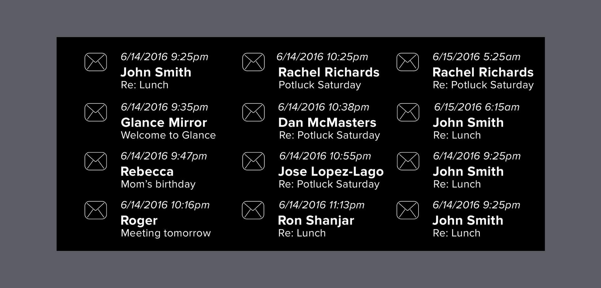
"Expanded" email mirror state
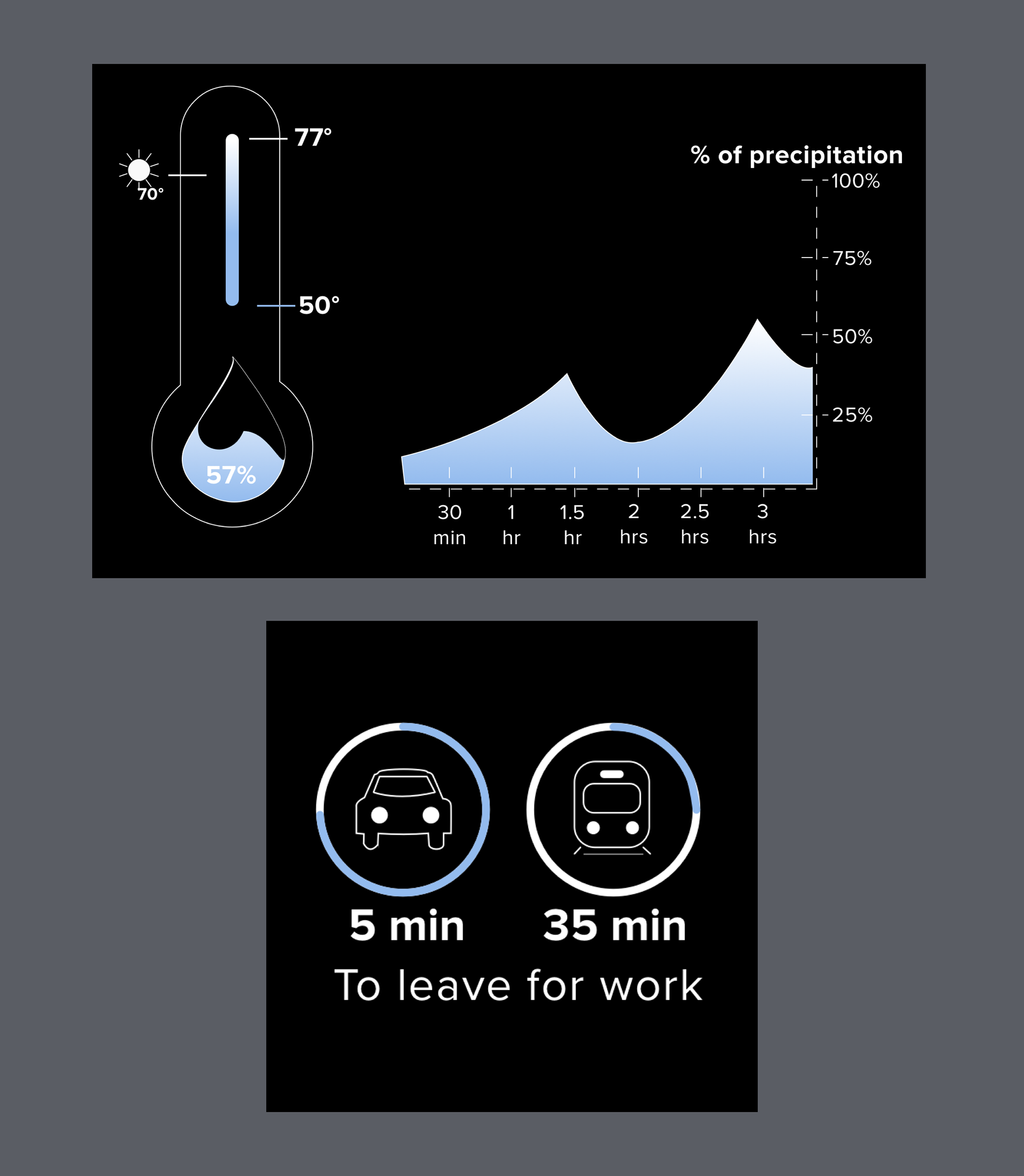
Expanded weather and commute infographics
Users can activate expanded icon states by using the voice command “Glance, expand (icon name).”
I used the animation software Principle to create mock-up transitions between the two states. Principle was new to me, but I found it pretty easy and figured out how to make the animations in about a day.
Designing the transition was a great chance to explore the space of the mirror. I thought it was important for the other icons to move to the upper part of the display. This way the pertinent information from the other icons was still visible for the user.

Transition from normal to expanded weather state
The other transition I designed was for the time function. I wanted the clock icon to be interactive in some sense. I had the idea to design it on a 24 row grid and have each row represent an hour of the day. The time would move down the vertical axis as the day progress. I thought it would be helpful for the event to be prominent as the time gets closer to it, so I bolded the font and changed the wording to be more urgent.
One of the biggest advantages of working on Glance and with Windy City Labs was proximity. WCL was right across the hallway from us and this allowed us to not only receive feedback as we needed it, but also we were able to test our designs on the Glance prototype. Glance's prototype wasn't nearly as sleek as the final product and the display had a lower resolution as well, but being able to to see my designs on a display that was similar proved to be invaluable. Designing for Glance raised a lot of questions about how things like font size and weight, line weight, and color would all actually look on the mirror. I knew there were limitations, but I wasn't sure exactly what could be done until it was on the prototype.