Client: DESIGNATION
Scope: 6 Weeks
Role: UX and UI Designer
Tools: Axure RP, Photoshop, Illustrator, Sketch, and InVision
00 | Overview: Health Disruption
For this mock project, my team was tasked to create a digital product which focused on the current trend and technological disruption in the health and fitness market. During three one-week UX sprints and three one-week UI sprints, we developed Amino, a health food recipe and ingredient delivery app that allows user's to customize their weekly menus based on their diet and taste preferences.
Coming from a visual arts background, this was the first time I worked on a team to develop a product from the ground up. On top of that, the topic seemed very broad and the idea of addressing this serious problem in just six short weeks seemed daunting. I thought the best way to begin the project would be to narrow the focus.
After discussing the brief with my group, we all agreed that the scope was very wide and that it might be a good idea to narrow it down from the beginning in order to approach the user interviews in the most efficient way. We researched current health trends and found that there has been a rise in obesity in America over the last decade. Besides the obvious physical health risks there are high financial cost and mental health issues associated with poor diet and obesity. We also found a study that pointed to nutrition being of greater importance than just exercise alone. This initial research lead us to focus on nutrition and diet for our product.
01 | Research: Trimming the Fat
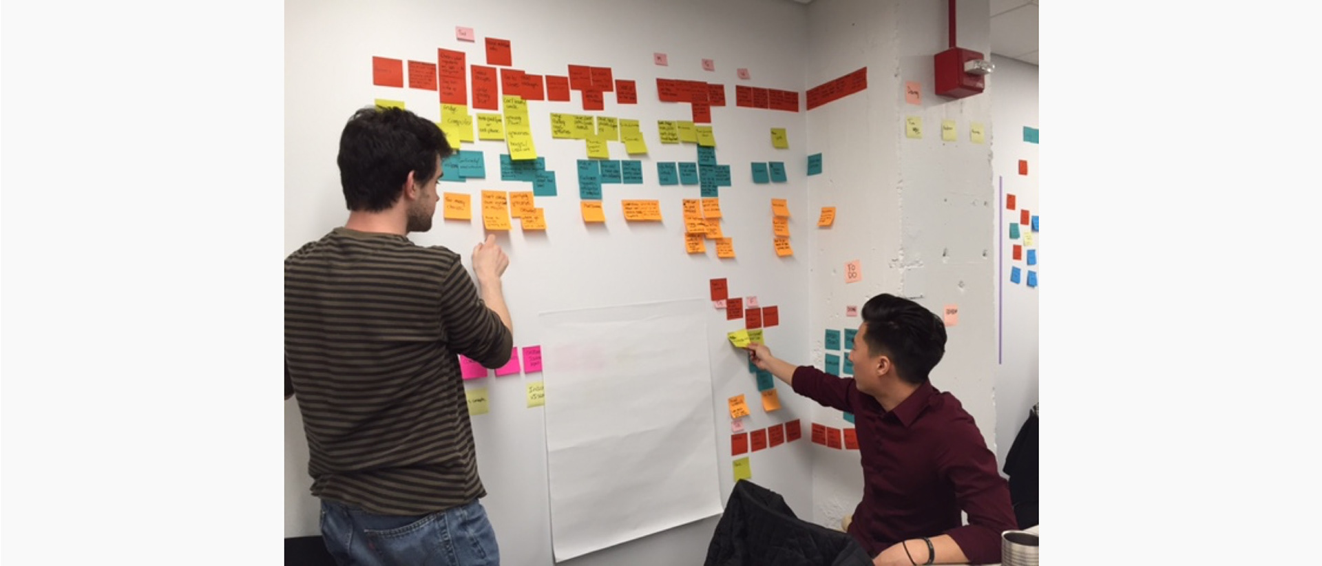
With the scope of the project now focused on food and nutrition, we explored people's eating habits and current food trends through domain research, user interviews, and surveys. We asked people about their definition of eating healthy, their eating habits and motivators, and how they hear about new foods or recipes. After two days of user interviews we started to compile our findings and synthesized the results by making an affinity diagram.

Affinty Diagram
This process seemed pretty overwhelming, but once we started to get it all up on a wall we started to notice pretty clear trends from the responses to our questions. The affinity diagram helped us identify lack of time, the flavor of health food, and lack of knowledge as the most common blockers that prevented people from eating healthier.
Based on all this research, we were able to generate a primary user persona, Brooke.
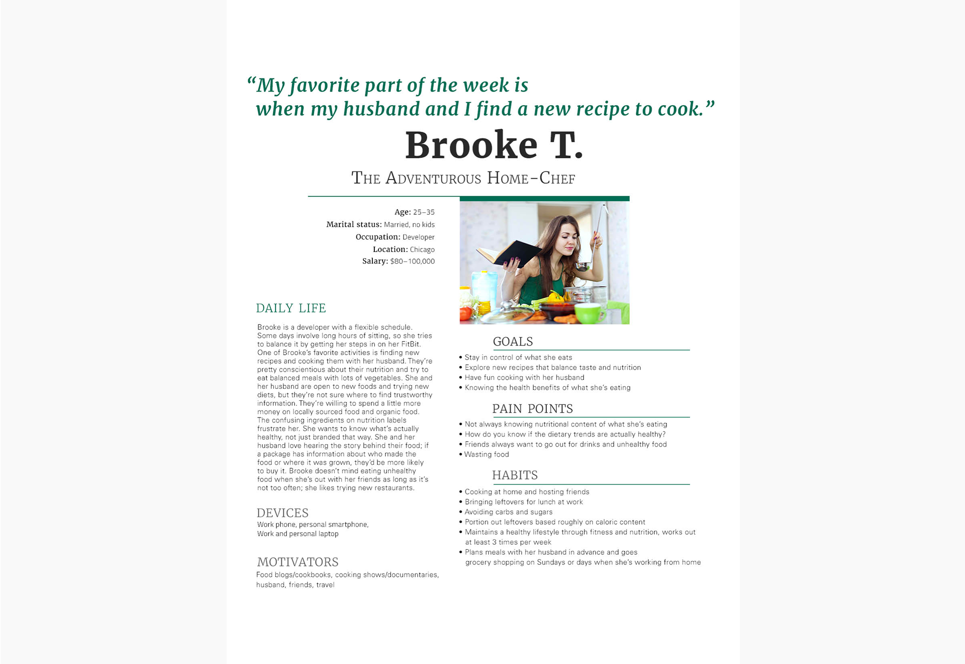
Brooke, the Adventurous Home Chef
The “Brooke” persona incorporated the goals and frustrations we found in our research into a relatable story and personality. Brooke is a married professional who really enjoys cooking with her husband. Eating healthy is very important to her, but she is often unsure which diet and foods are right for her and is confused about the content of nutritional labels. Additionally, her busy and unpredictable work life sometimes interferes with her healthy eating goals.
02 | Define: Finding the Recipe
Creating a persona based on our research helped us identify key places where our product could aid users to eat healthier. A rapid brainstorming session identified the discovery and planing to be the most stressful phases in Brooke's journey.
Rapid Brainstorming of Brooke's Customer Journey
Developing concepts in such a quick manner was new to me, but it helped us explore many concepts and see what was going to work. I have a tendency to obsess over one idea for too long, so having the constraint of time and the support of a team really helped me overcome this.
This rapid brainstorming session gave us a better understanding of the context, personality, and voice of our product. In order to maintain this personality and voice we created a set of principles used to guide design decisions from this point forward. These principles were constantly referred to help push concept generation as well as aesthetic and tonal direction.
Simplicity
Information will be easy to understand
Reconnect with Food
Brings users and the food they eat closer together
Educational
We will help users understand what they are eating and why
Efficiency
Provide convenient options that don’t break the user’s flow
03 | Design: Preparing the Ingredients
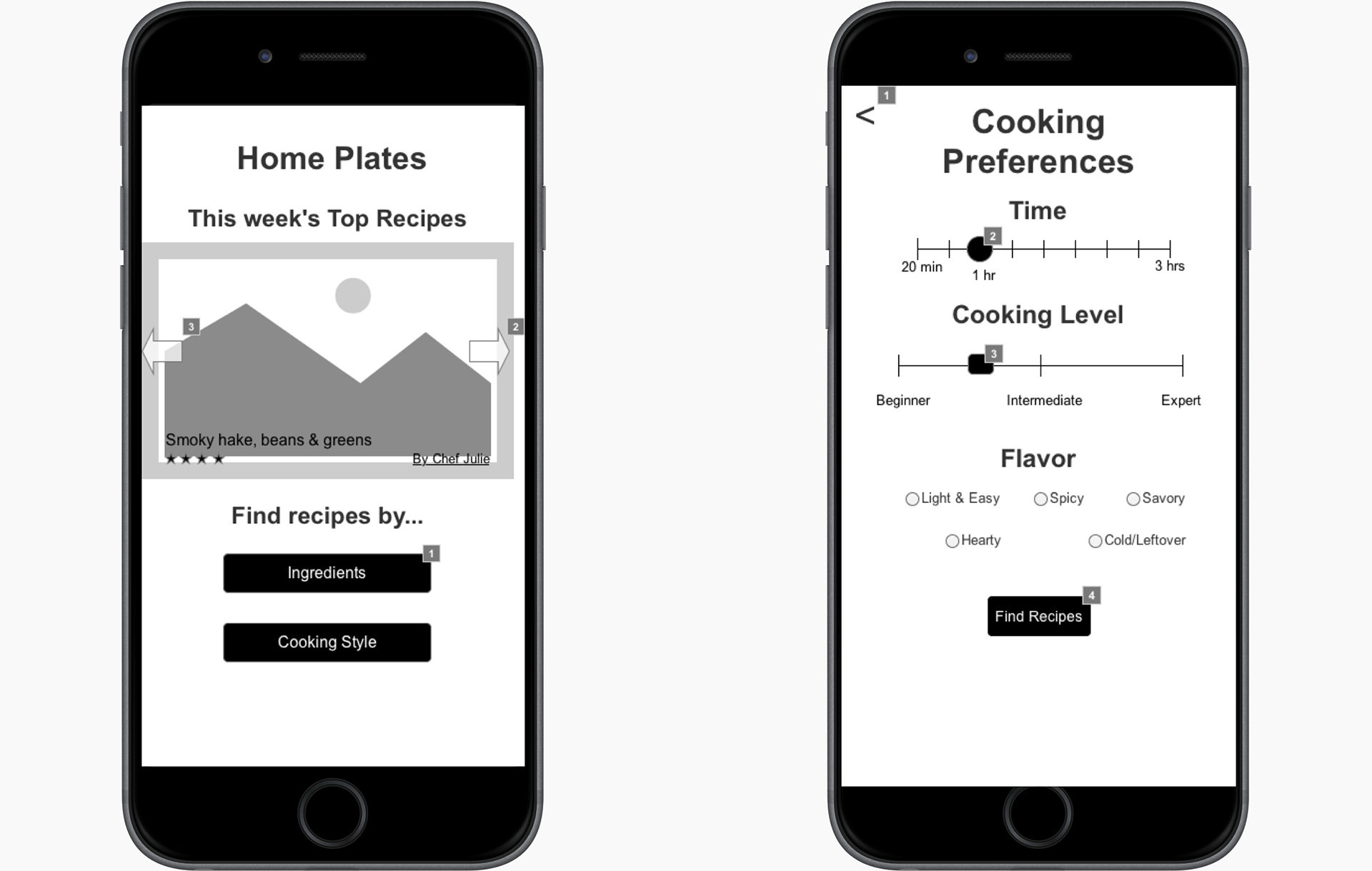
With our problem now defined, we validated our initial concepts using paper prototypes then moved forward to mid-fidelity wireframes. At this stage, I wanted to test the usability of my concept by developing the content for recipes, exploring different search filters, and designing interactions.
Recipe Content
Using the design principles of simplicity, reconnect with food, and educational, recipe description gave the user a clear, enticing, and informed idea of a dishes taste and also suggest pairing options to further bring out the flavor.
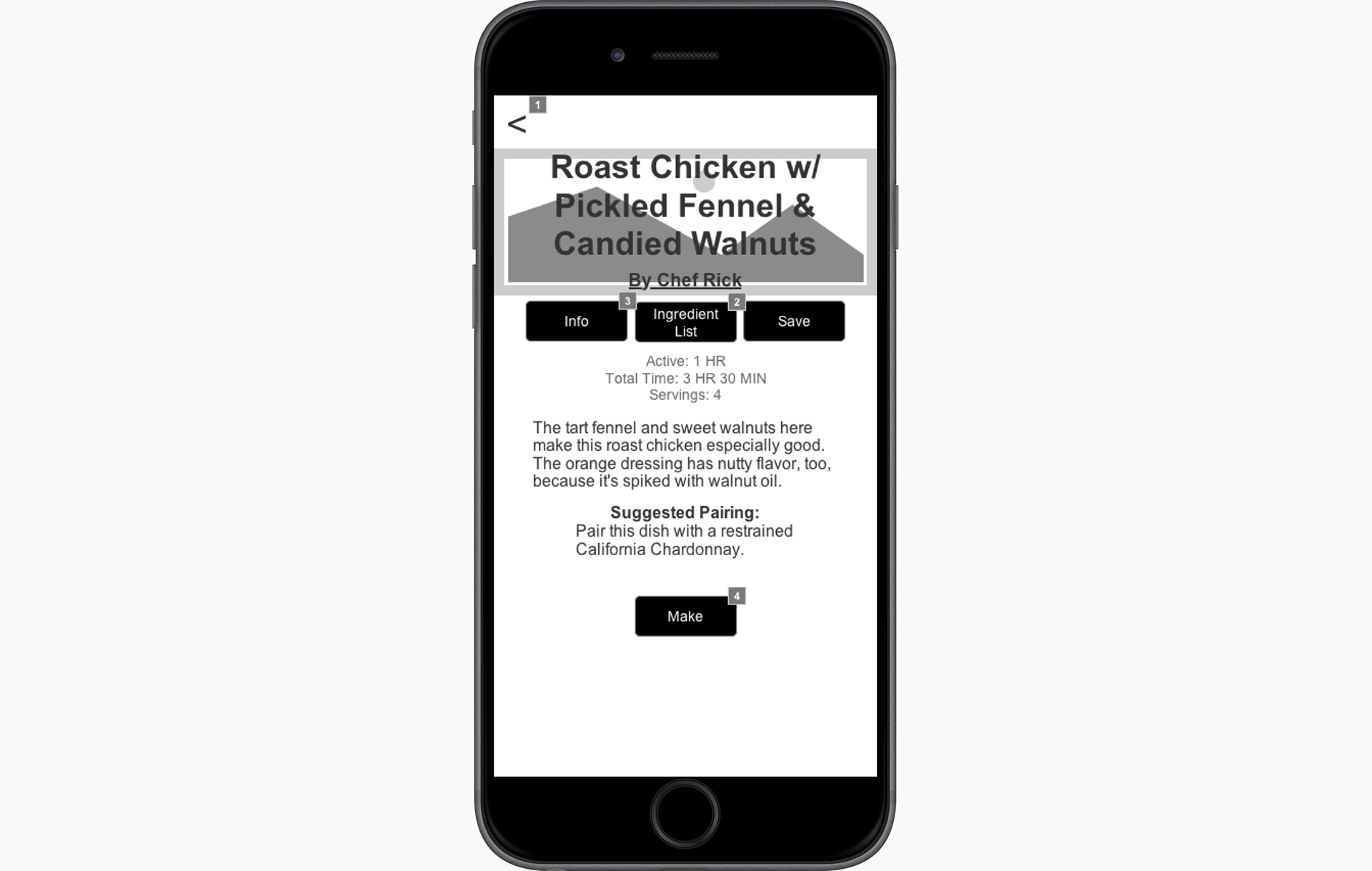
Recipe Content
Search Filters
Focusing on our design principles of efficiency and simplicity, the user could search for recipes based on the amount of time, difficulty, and flavor of a recipe. Additionally they can find recipes based on ingredients that they may already have.
Interaction Design
I had used Axure before and was pretty confident I could make some of the interactions I had in mind for my concept. Motivated by our educational, efficiency, and simplicity design principles, I designed an interaction where users could drag the ingredients they had in mind into a virtual plate, that was divided into the FDA recommended portions for a balanced meal (50% vegetables and fruits, 25% protein, and 25% starch). My main goal for this interaction was to give user a fun, interactive way to find healthier, well-balanced recipes with the ingredients they wanted.
Test Results
Users liked being able to search for recipes by things like cooking time and flavor
Users enjoyed the interactive plate building feature, even though they were generally unaware they were building a more balanced meal
The recipe descriptions gave them a clear idea of the flavor of a dish
There was a lack of marconutirient and health benefits for the recipes
Comparing the usability test results from all three of our apps, we determined that the concept that best addressed our problem was my other teammate's app called “Mad Chef.” The basic concept for Mad Chef was that user's would receive a weekly delivery of three featured ingredients along with suggested recipes for these ingredients.
Moving Forward
With one app concept now defined, we each created individual styles tiles to quickly explore some of the UI elements such as, color, font, and button styles. For my style, I wanted to highlight the flavor and spice of the recipes so I used a warm and analogous color scheme, sharp angled corners on buttons, and a strong, bold geometric font.
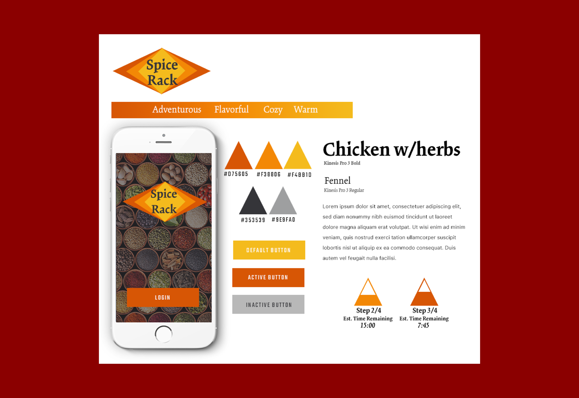
Warm and Natural Style Tile
To design the high-fi mock up screens, I found it extremely helpful to refer back to our design principles to help guide my design decisions.
Simple and Educational
I used colored coded icons and brief notes to give users clear and concise nutritional information and benefits, flavor notes, and tips for preparing and cooking the ingredients and recipes.
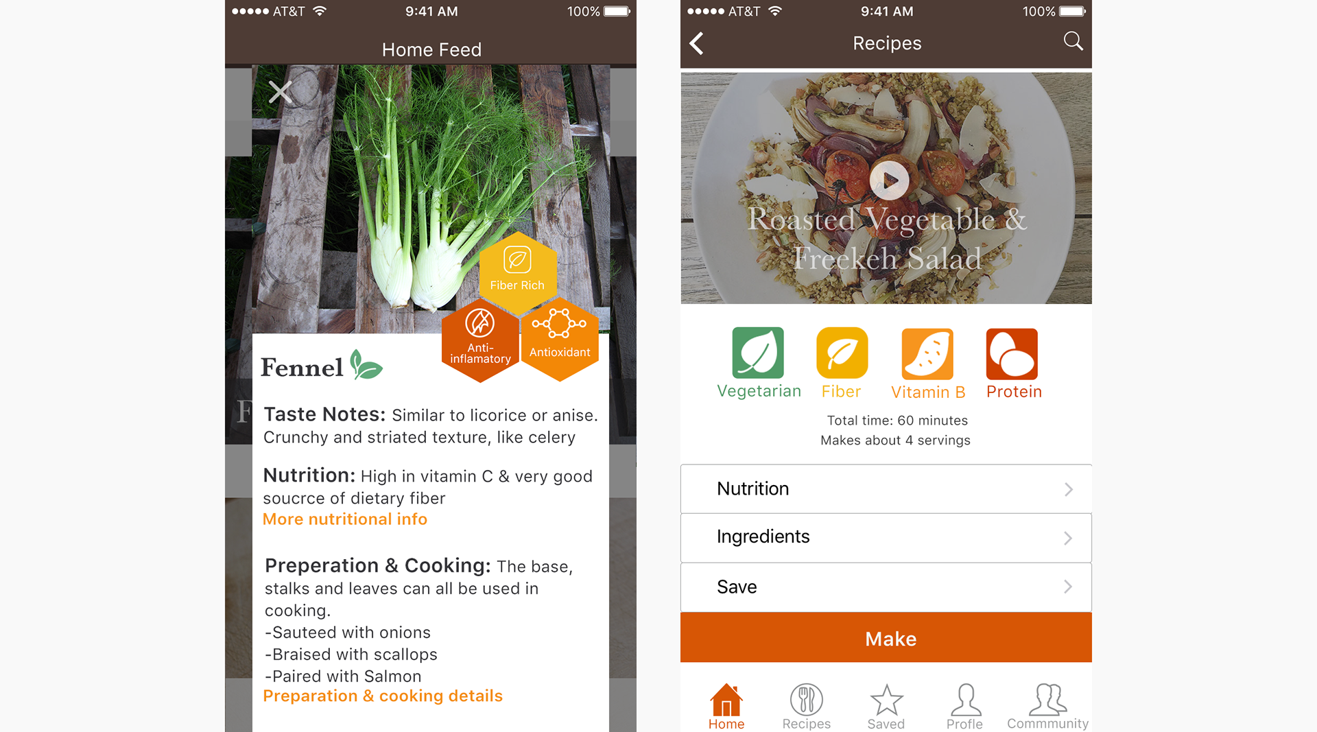
Reconnect with Food and Efficiency
I focused on using large close up photos of the dishes and ingredients and gave users access to the weekly ingredients and recipes on the home page right when they open the app.
Having design principles and feedback from user tests gave me a clearer conceptual focus and allowed me more time to explore on the design of the UI. I iterated on several different versions of the icon and recipe step pages before settling on the final version for user testing.

Three Iterations of Icon Design on Home Page
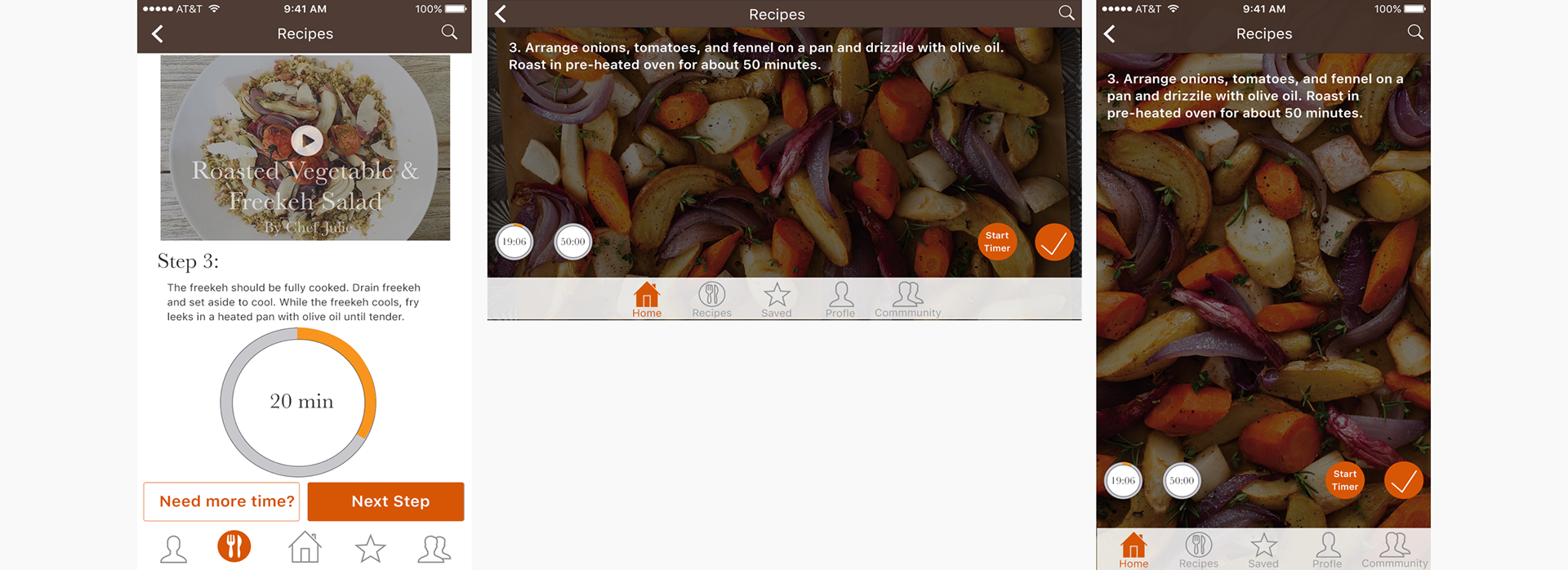
Three Iterations for Recipe Step Design
04 | Testing: Taste Test
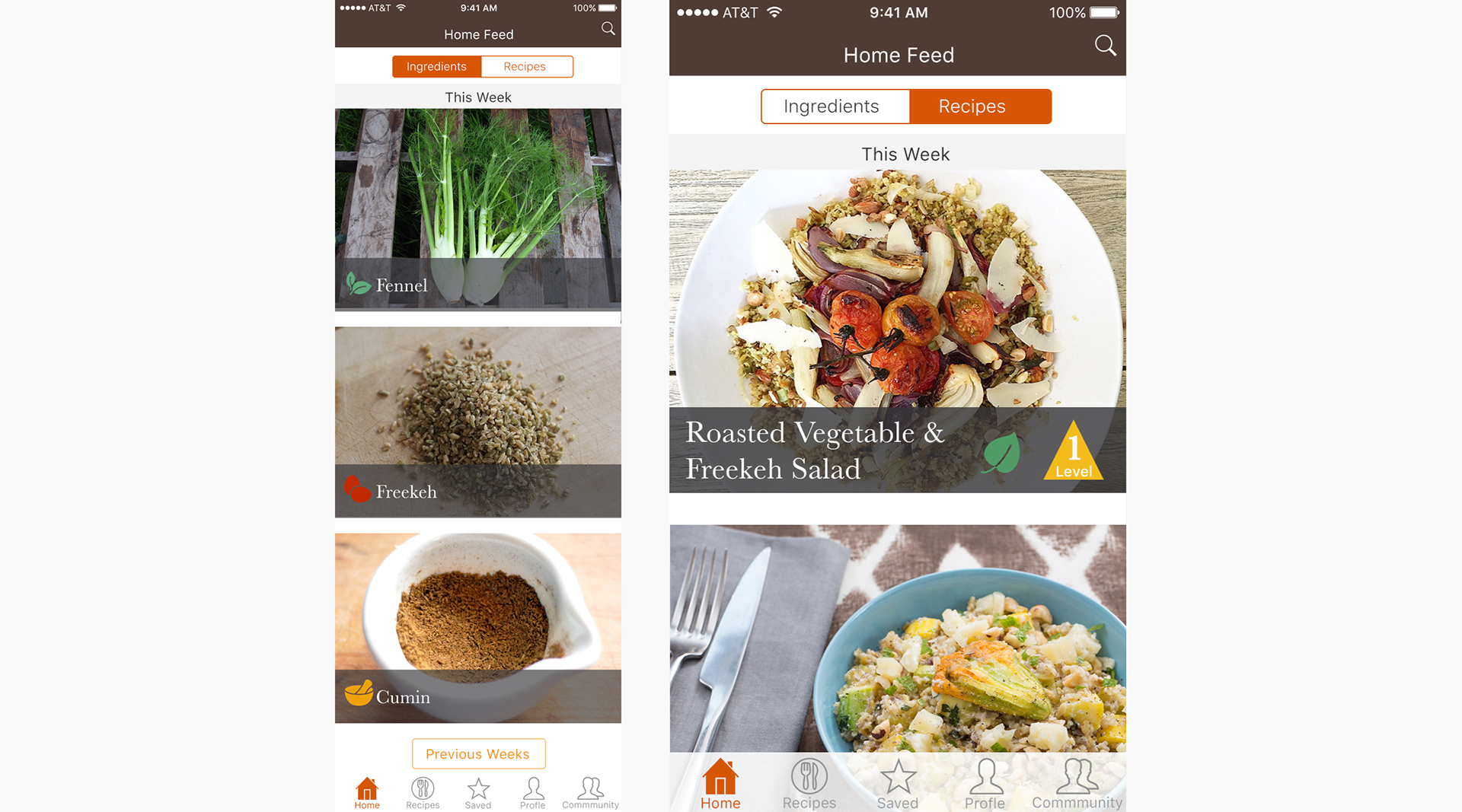
To conduct our final round of user tests, we used InVision to create clickable prototypes. The prototypes walked the user through the flow of looking at the ingredients of the week, selecting a recipe, and going through the steps to make the recipe.
Home Page (Click Image to View InVision Prototype)
From this user test we found that users preferred a clean layout with large vivid pictures, video as the primary method for instructions, and warm bright color schemes.
This feedback helped us move forward with our final UI direction, but a critique with our creative director started to expose some bigger conceptual issues with our app. He was concerned that our product had become another recipe app and didn't focus enough on the health and nutritional aspects of the brief. Additionally, he had concerns that only having three ingredients delivered a week really didn't save the user any time because they would still have to go to the store to buy the other ingredients for the featured recipes. Once pointed out, these flaws seemed pretty obvious, but our team got a little distracted with putting in features and making everything look nice that we started to lose sight of our design principles. So, in addition to finalizing our UI we also had to go back to our research and iterate on the concept a little more.
05 | Iterate: Adjusting the Flavors
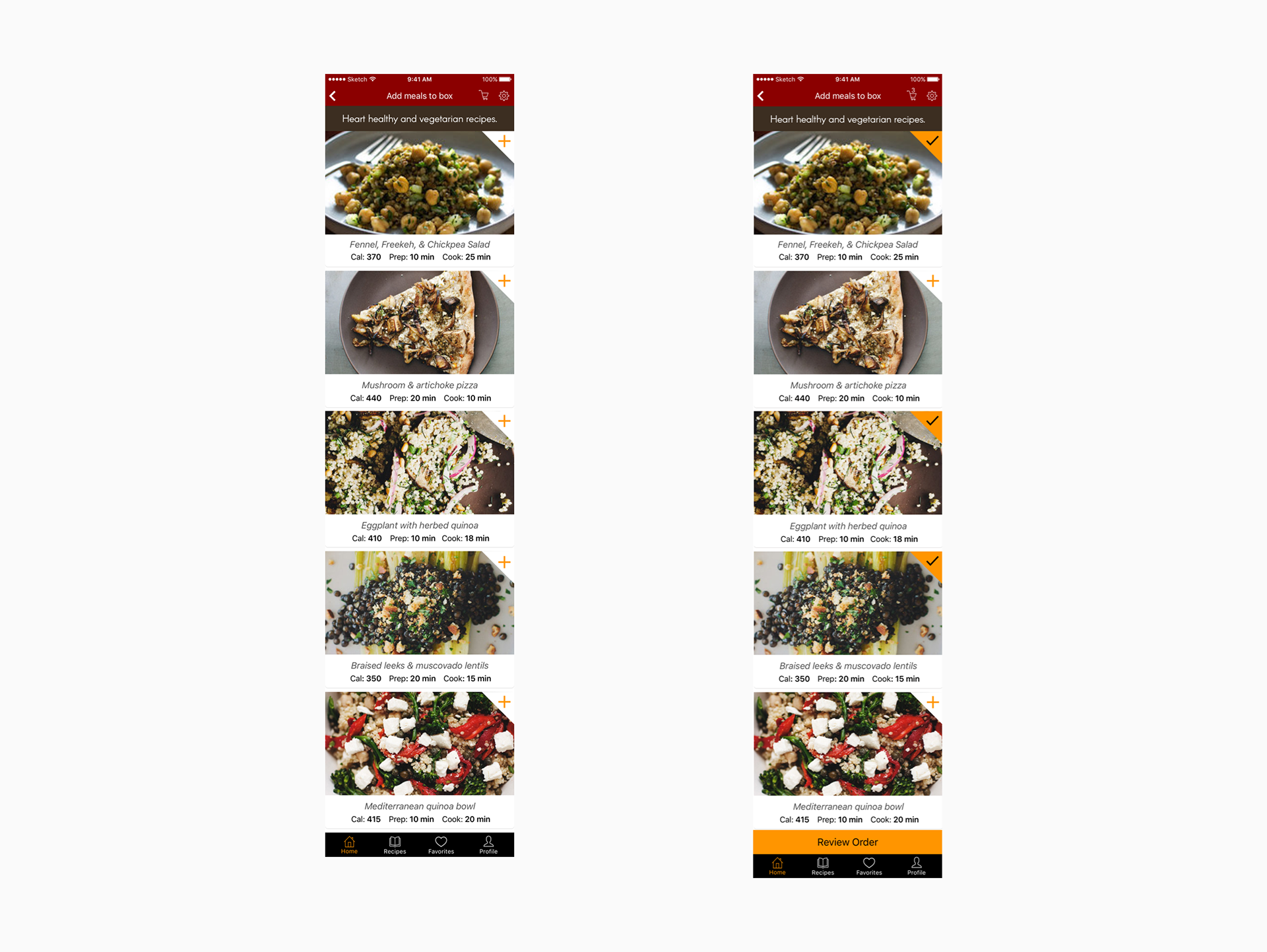
In order to address the conceptual issues and design a unified style with just a week left in the project my team broke up the work into individual parts. The first thing we changed was the basic concept. My other two team members designed a new logo and wrote new content and a new user flow, while I started revising the visual style based on user feedback. We decided that instead of recommending ingredients to all users, it would be better to have the app generate recipe suggestions based on the user's nutritional goals, dietary preferences, and cuisine style. Users could then have all the ingredients delivered to them on a weekly basis. The next thing we changed was the name of the app. We decided that because the concept had changed that the name Mad Chef didn't really make sense anymore. After some discussing we decided on the name Amino.
Designing the visual style really taught me a lot about using typography and chunking to create hierarchy and a design system. Coming from a fine arts background, I felt I knew a lot of visual things about color and form, but hadn't really had the chance to use a lot of these kinds of design elements before working on Amino. Working on Amino really showed the importance of good and simple design and type treatments when creating a usable interface.
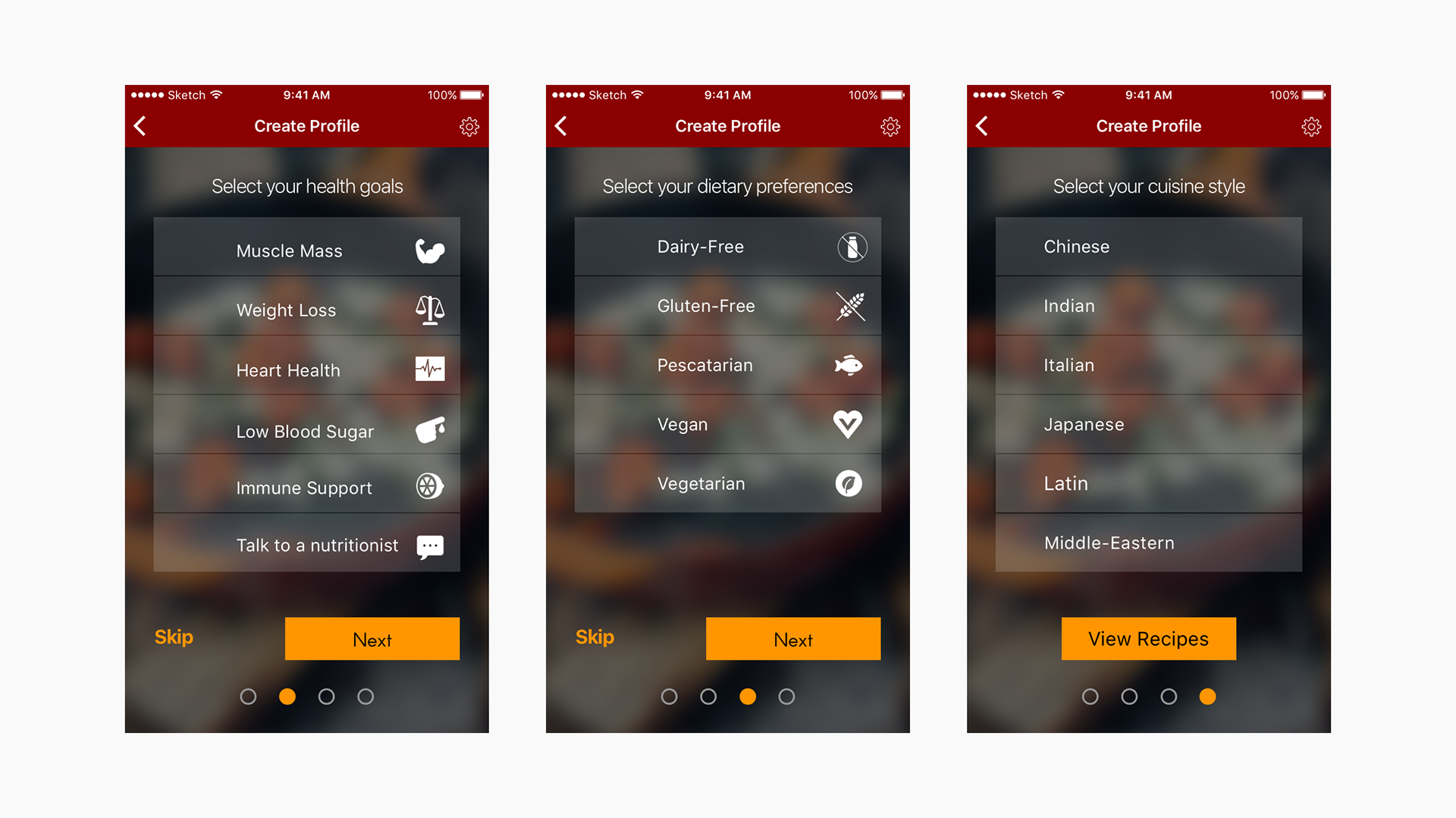
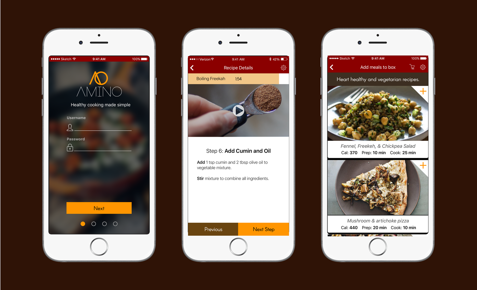
Amino On-Boarding
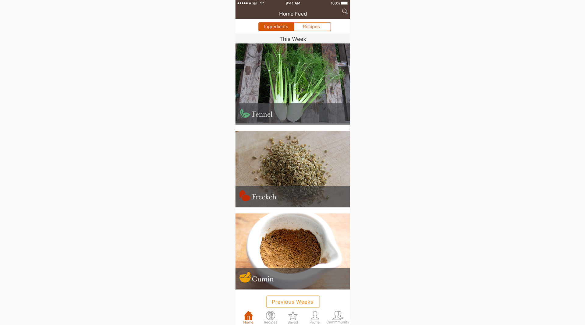
Weekly Recipes
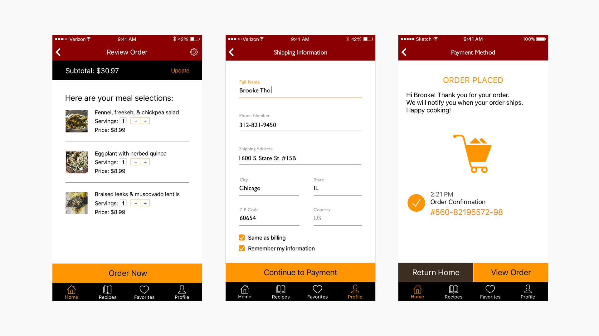
Ordering Weekly Ingredients
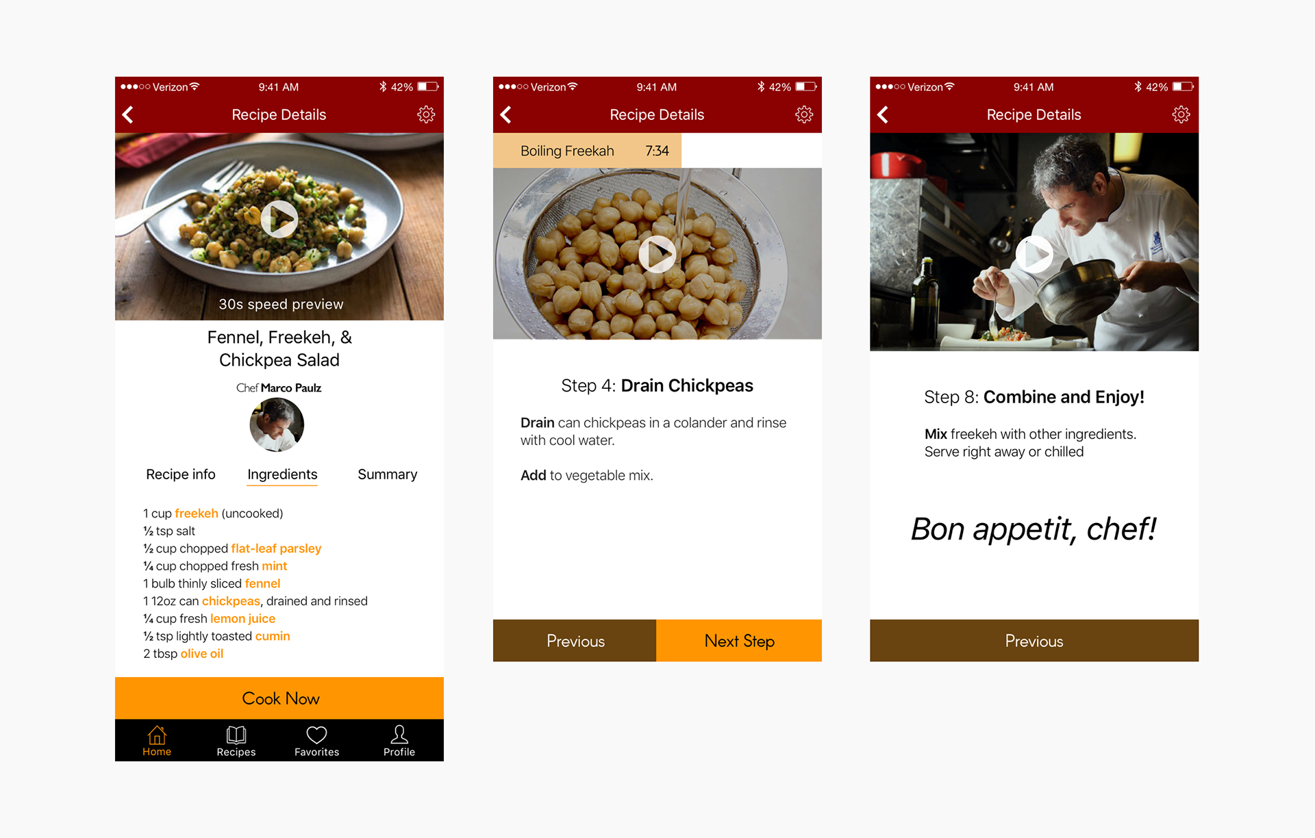
Ingredient List and Recipe Steps
After less than a week our group was able to re-work several elements of our product to create a MVP that started to address the brief. If we had more time, we would've liked to test this new concept and design with more users and figure out how to promote a healthier lifestyle. Other considerations we would have liked to include in Amino included expanded search functions, community and sharing features, developing a web platform, and a way users can set and track health goals.
Final Thoughts
Working on Amino was a fun, fast-paced, and eye-opening experience. It was the first time I had ever worked with a team to research and design a product from the ground up. I discovered a lot about the UX and UI process. Some of the most important things I learned were:
Work Quickly
Generating ideas in a rapid manner allows you to work through more solutions. Having multiple solutions helps remove your own personal bias towards one idea and makes it easier to scrap a solution when it isn't validated by user testing.
Test Often and Ask the Right Questions
This goes hand-in-hand with working quickly, the quicker and more frequently you can get something in front of a user the better a product will be. Additionally, I learned that when testing having a clear idea of what you want to learn is crucial.
Understand the research
This was probably the most important thing I learned and it feeds directly into the previous two. A solid understanding of the product domain and the user's needs helps you generate more focused solutions that emphasize benefits rather than features.
You can see how I applied these lessons on my next project, Glance…
This is just a quick overview and summary of all the work that went into this project.
If you want to learn more email me at tdwyer919@gmail.com.
Thanks for reading!