Client: VISANOW/Envoy
Scope: 6 months
Role: product & visual Designer
Tools: Sketch, photoShop, Illustrator, InDesign, Wordpress, Hubspot
Envoy (formally known as VISANOW) is a global immigration service provider that offers a platform to help employers organize, manage, and track their global workforce.
As a Product Designer at Envoy, I helped design for several user types and flows. Some of the most typical flows involved managing Foreign National employees and digital files, case profile and questionnaire completion, and viewing company reports. The users consisted of HR Managers, Foreign National employees, and lawyers, each having very different needs and sometimes different workspace views. Additionally, I designed more exploratory conceptual style tiles and pages for use in future designs. Below is a small sample of some of these different flows and designs.
Public Access Files
In order to stay compliant with government audits, HR users need one location to quickly access and manage a case's digital Public Access File. I designed the solution to this problem to give the user insight into the current status of a case's Public Access File and complete the actions needed without breaking the user's flow or navigating them to a new page. This way a user can upload documents, complete a form, or notify a attorney or employee all on the same page.
Case Timelines and Milestones
Company Reports
As a Visual Designer for the marketing team, one of my main responsibilities was to help rebrand collateral, email campaigns, landing pages, and other material from the old VISANOW brand to the new Envoy brand.
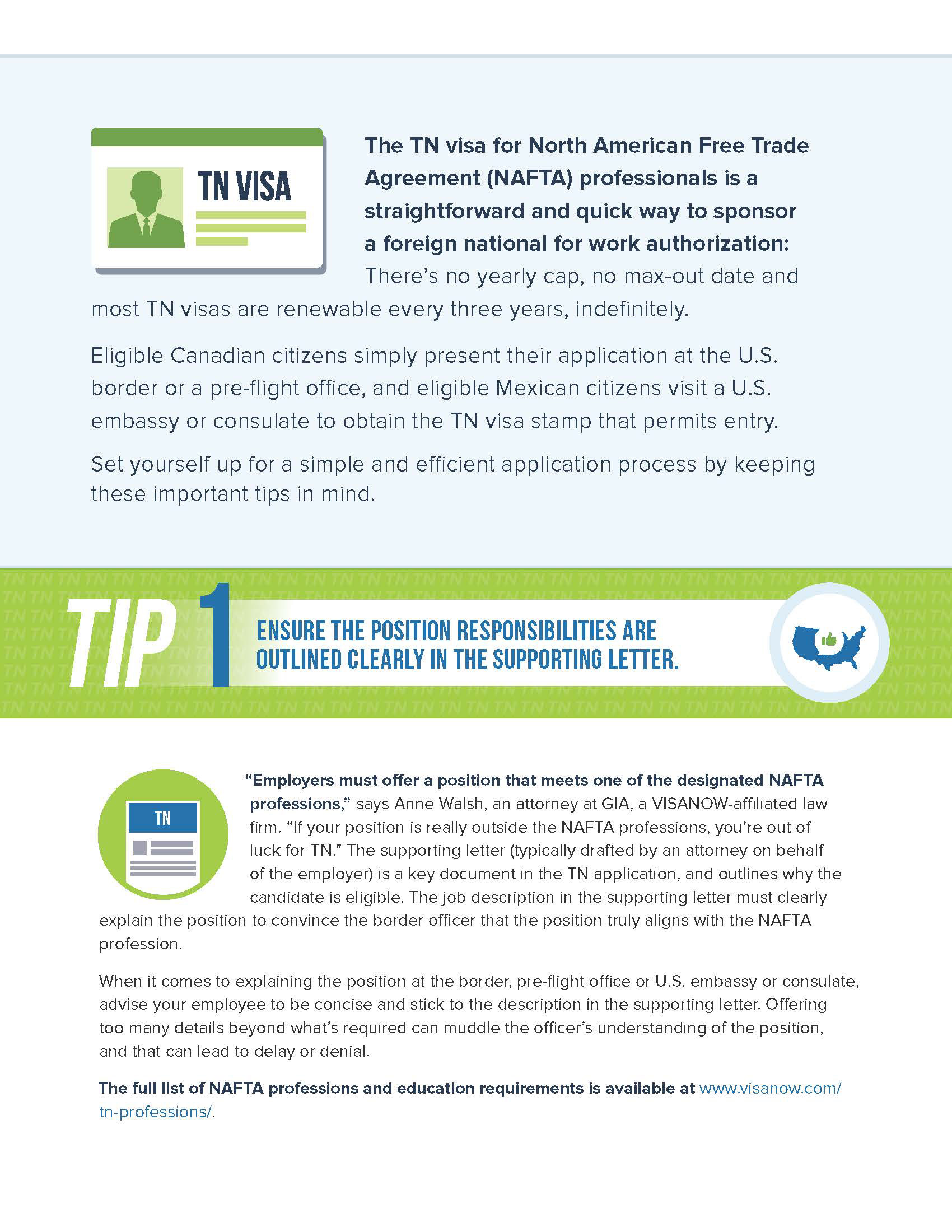

Example of an Envoy visa resource before (left) and after (right) rebrand
The old brand used a blue and green color scheme and relied heavily on icons. The new brand used a more naturalistic approach, focusing on grey and beige colors with accents of purple and orange and using double exposure treated photography which blends cityscapes with workers. I used Photoshop to treat and blend the photography and InDesign for the text and styling.
Whether starting a new campaign or rebranding and updating a new one, the first step was to design the collateral. The pieces of collateral served as informational overviews sales reps could give to customers to inform them about our services or criteria on specific visas and application processes.

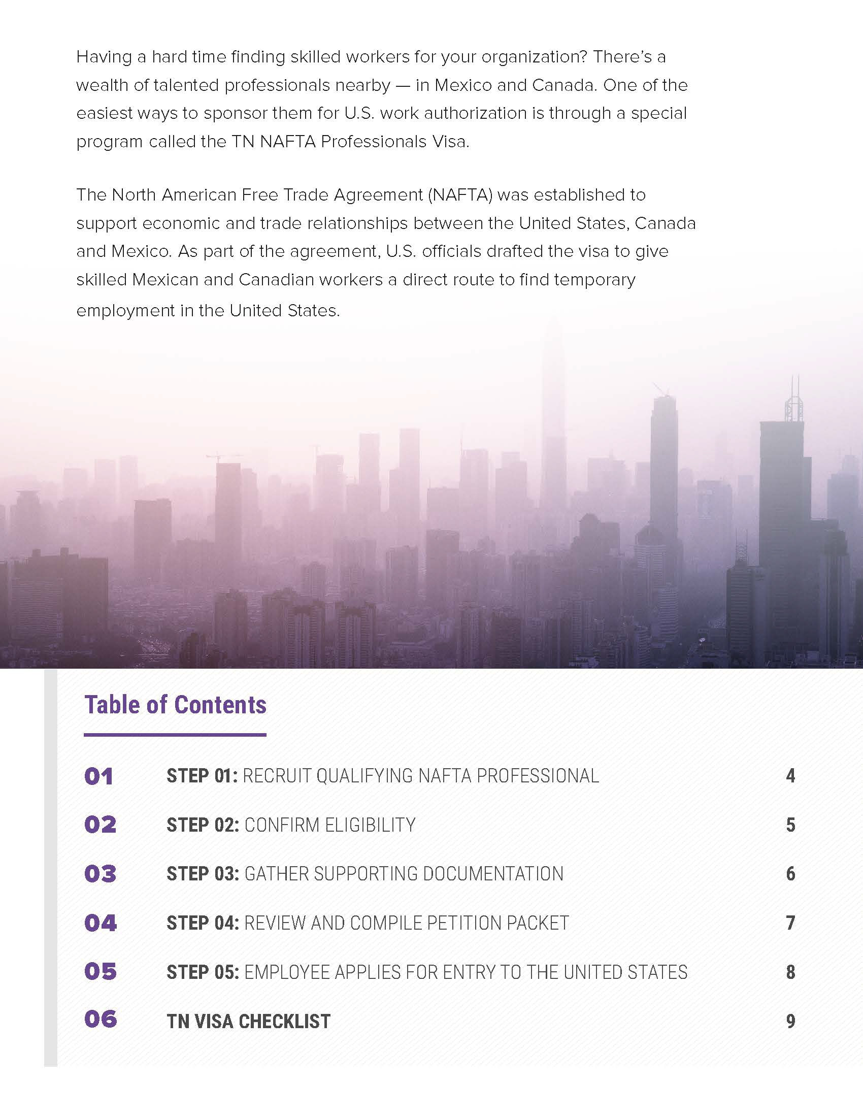
Envoy TN Roadmap Cover and Table of Contents
The work I did in DESIGNATION was all digital device based, so coming into Envoy and having to design print material and deal with a lot more copy proved to be quite the learning experience. The key thing I learned was keeping a balance between text and graphics and following a good hierarchy to help guide the reader.


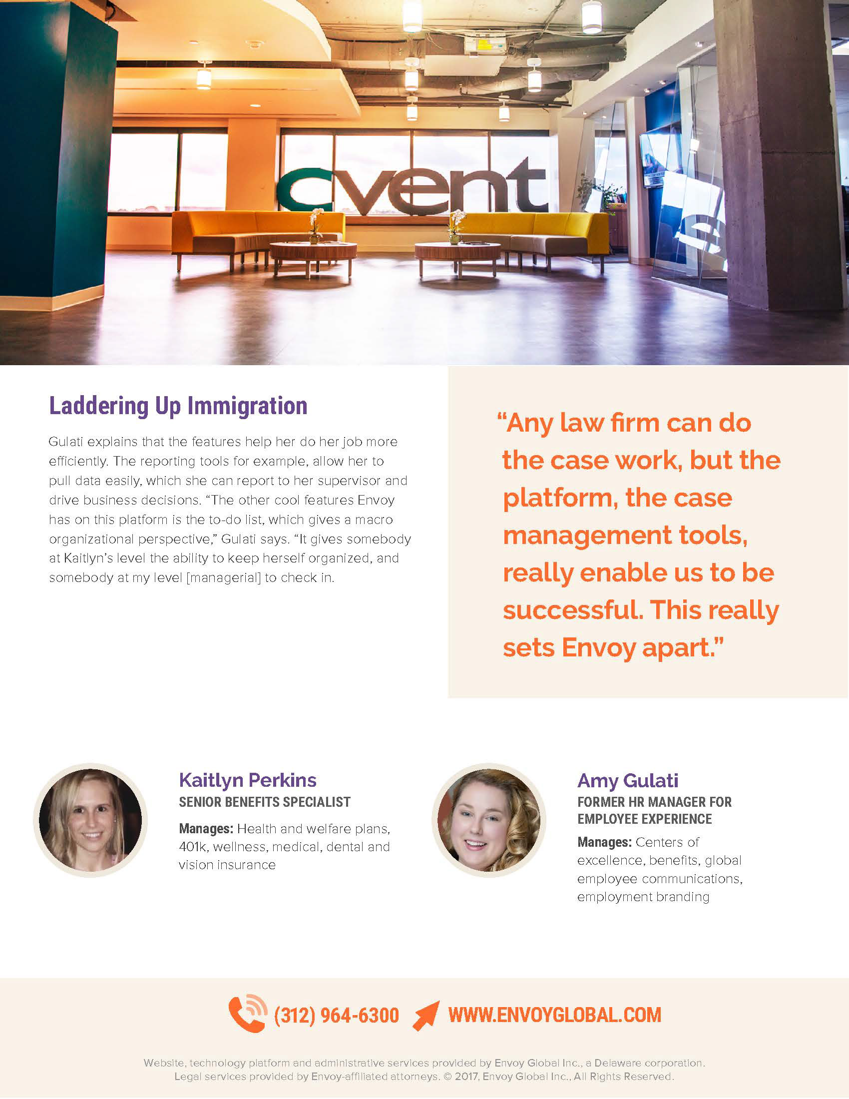
Envoy Case Study
I was fairly new to InDesign, but with the support and help of the other designer and creative director I was able to pick it up pretty quick. I found using paragraph and character styles really helped establish a design system and made the process quicker. I also found that creating repeatable grid systems helped create continuity between different pages and different pieces of collateral overall.

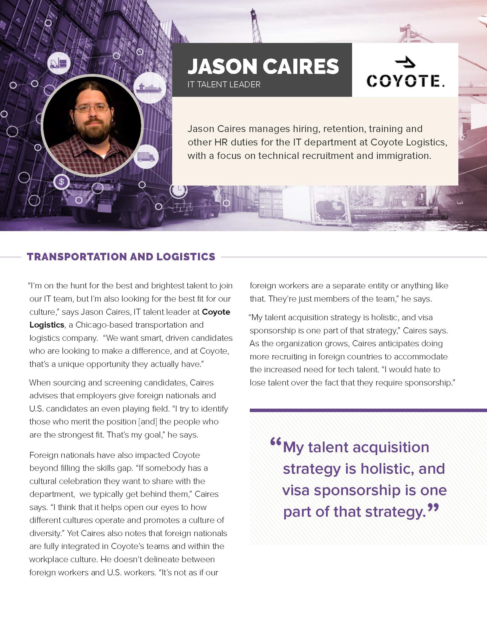

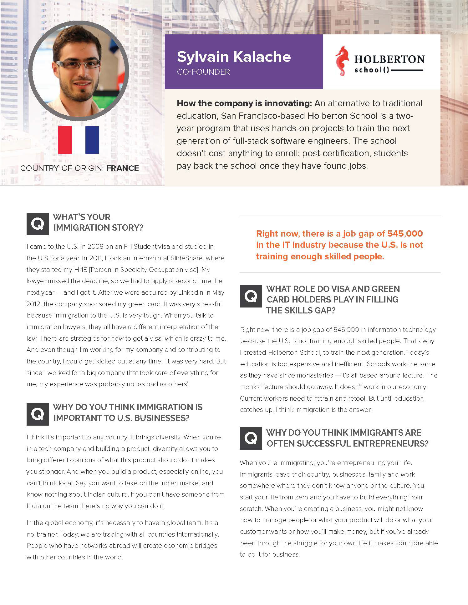
One of most difficult pieces to design were one sheets. Having such a limited amount of space presented many challenges to maintain a proper balance of copy to graphic well staying within the established brand.
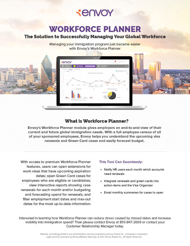
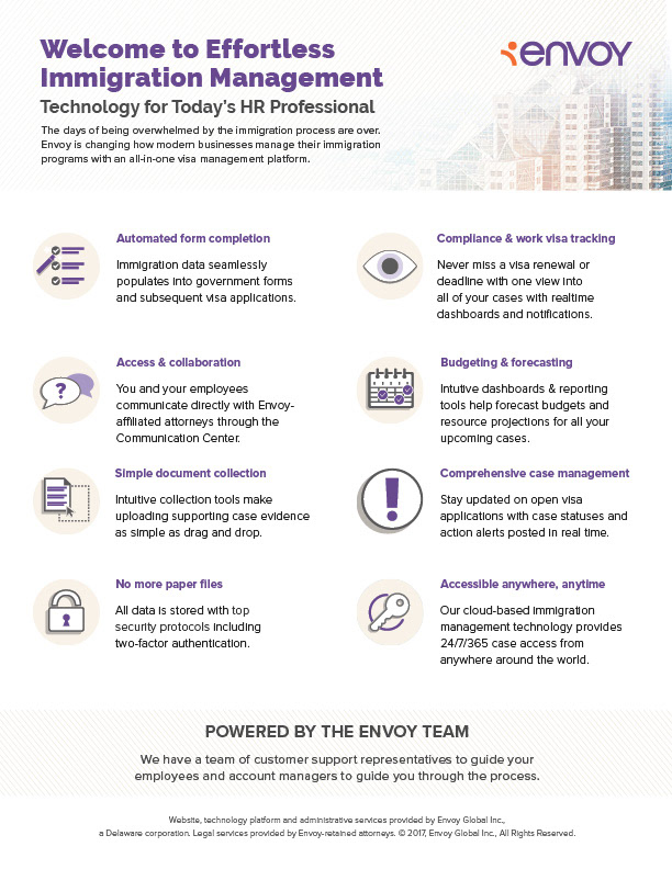
Workforce Planner and Technology Onesheets
After designing each resource, I designed the landing pages and emails associated with that campaign and resource. First I mocked up the design for the landing page in Photoshop. Then, once approved, I exported the assets (headers and icons) to bring into a Hubspot template. Additionally, I made a longer and less wide 2x version of the header for mobile. When the landing page was done, I then used the same process to design email headers and assets.
Photoshop Mockup for 5 Tactics for TN Visa Success
Desktop Header Image for 5 Tactics for TN Visa Success Landing Page
Mobile Header Image for 5 Tactics for TN Visa Success Landing Page

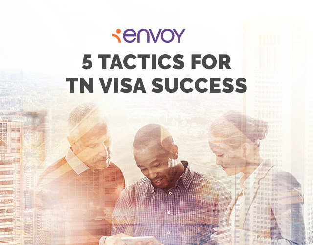
Desktop and Mobile Email Headers
5 Tactics for TN Visa Success Email Designed in Hubspot
My goal when designing the landing page and email headers was to maintain the look and feel of the collateral it was promoting. This way the customer would have a clear connection between the two. Often this was done by taking the cover of the collateral and rearranging and resizing it to fit the header dimensions.


TN Visa Roadmap Cover and Landing Page

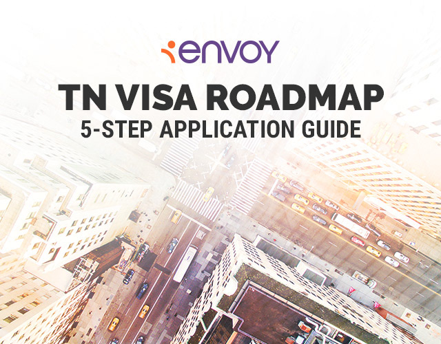
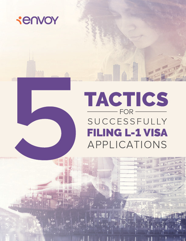

5 Tactics for Successfully Filing L-1 Visa Applications Cover and Landing Page Header
Working at Envoy was a great experience. I learned a lot by coming onto a team with a set process in place. It was the first time I worked on a larger team that consisted of more then just designers. I learned the importance of keeping shared folders and docs organized and using consistent naming conventions and versions, allowing other team members to find a file quickly and with ease. Prompt and clear communication was key when getting designs reviewed and approved and when handing final assets off to other team members. The most important thing I learned was how to work more efficiently and effectively. Organizing my workflow helped and having a set process in place allowed me to work quicker, make less mistakes, and maintain brand guidelines. My biggest takeaway was learning how to work within a design system and keep everything consistent both within a specific campaign and within a brand.
